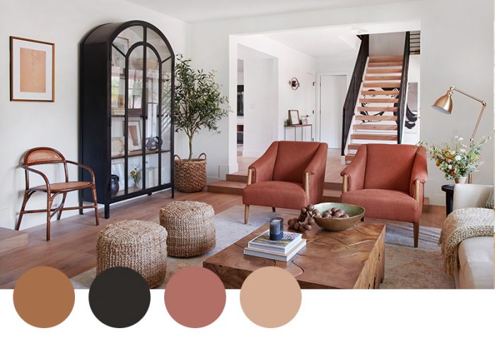
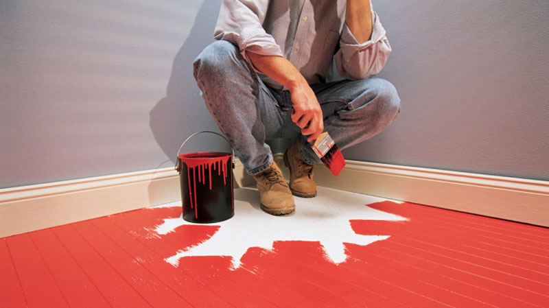
The 10 Most Common Painting Mistakes and How I Avoid Them

Painting walls at home may seem simple, but there are plenty of mistakes that can ruin the final result. I’ve learned from my own experiences and developed a system that helps me avoid these pitfalls. Here are the 10 most common painting mistakes and my tips for preventing them:


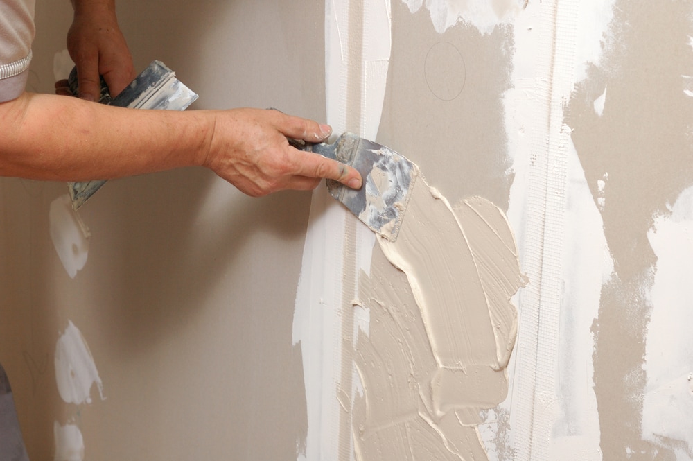
1. Skipping Proper Preparation

Mistake: Many people skip cleaning the walls or fixing imperfections, which leads to uneven surfaces and poor paint adhesion.
How I Avoid It: I always clean the walls thoroughly and fill any cracks or holes with putty. Once the putty dries, I sand the surface smooth for an even base.


2. Skipping Primer

Mistake: Not using a primer can result in uneven paint coverage and blotchy finishes.
How I Avoid It: I always use a primer, especially on new walls or ones with stains. Primer helps the paint adhere evenly and enhances the final color.


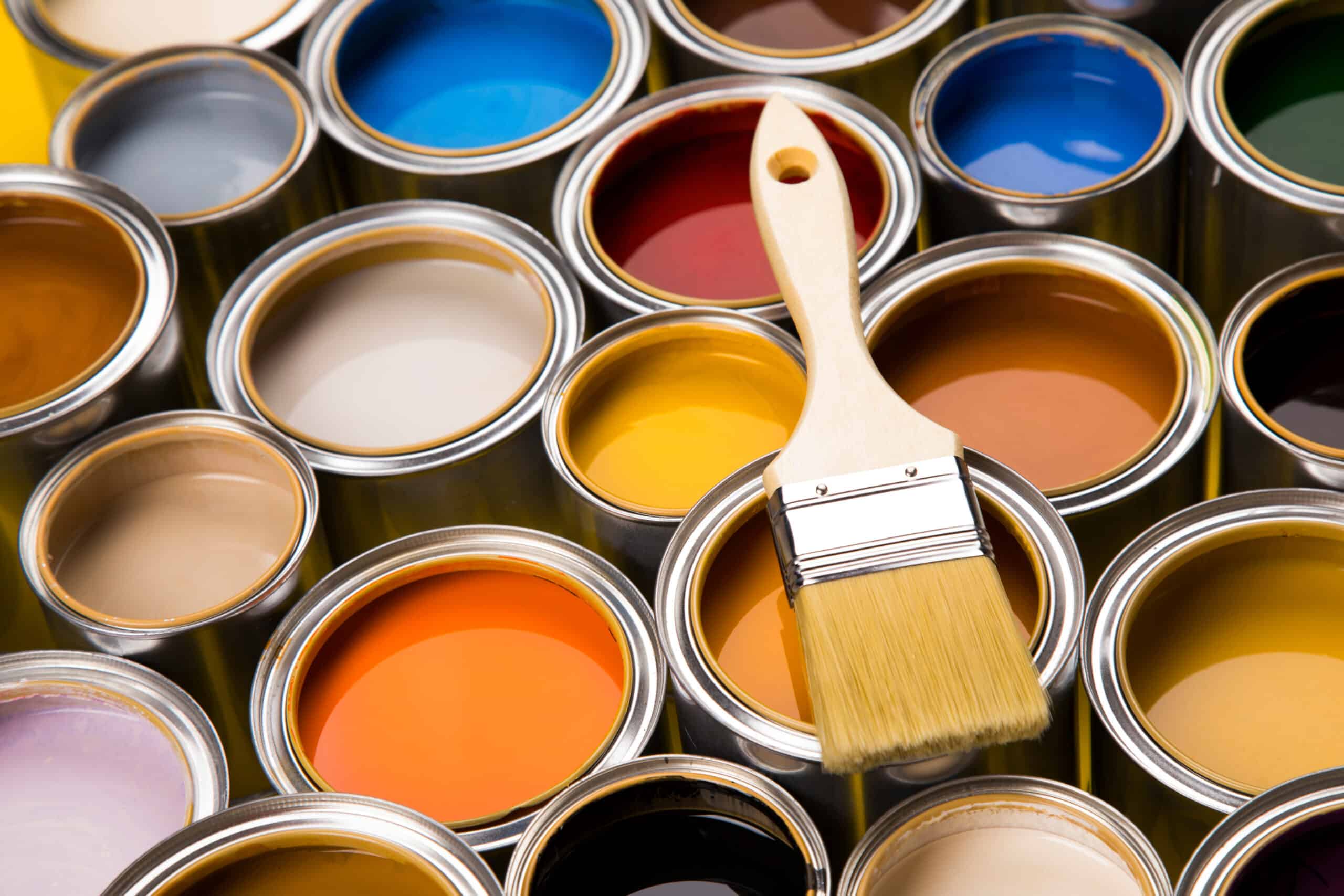
3. Choosing the Wrong Paint

Mistake: Selecting paint that doesn’t match the room’s needs, such as using non-washable paint in high-traffic areas.
How I Avoid It: I choose paint based on the room’s purpose: washable paint for kitchens or kids’ rooms and matte paint for bedrooms.


4. Using Low-Quality Tools

Mistake: Cheap brushes and rollers can leave streaks and uneven coverage.
How I Avoid It: I invest in high-quality brushes and rollers, which make the job easier and ensure a smoother finish.


5. Using Incorrect Techniques

Mistake: Applying paint too quickly or too slowly can cause streaks and drips.
How I Avoid It: I work steadily and use a „W” or „M” motion with the roller to distribute the paint evenly.


6. Ignoring Drying Times Between Coats

Mistake: Impatience leads many to paint a second coat before the first has dried, causing blotches.
How I Avoid It: I let each coat dry completely before applying the next one to ensure smooth, even coverage.


7. Over-Thinning or Over-Thickening Paint

Mistake: Using paint that’s too thin or too thick results in uneven coverage or dripping.
How I Avoid It: I follow the manufacturer’s instructions and measure carefully if I need to thin the paint.


8. Poor Lighting While Painting

Mistake: Painting in bad lighting can lead to missed spots or uneven finishes.
How I Avoid It: I ensure good lighting by painting during the day or using strong, portable lights.


9. Neglecting Edges and Corners

Mistake: Overlooking edges and corners can make the finished job look sloppy.
How I Avoid It: I always start with a brush to carefully paint edges and corners, then use a roller for the larger surfaces.


10. Failing to Clean Tools Properly

Mistake: Neglecting to clean brushes and rollers promptly can make them unusable later.
How I Avoid It: I clean all my tools immediately after finishing the job so they’re ready for future use.

Washable Paints: Are They Really Worth It?

Choosing the right paint for your home renovation is crucial, as it impacts not only the aesthetics but also the durability and practicality of the results. In recent years, washable paints have gained popularity due to their promise of greater resistance compared to traditional paints. But are they really worth choosing? Let’s explore when and why washable paints might be the right choice for your home!


What Are Washable Paints, and How Do They Differ from Traditional Paints?

Washable paints are specially formulated with components that make them more resistant to stains, dirt, and moisture. These paints typically create a smooth, slightly glossy, or satin finish, which allows for easy cleaning without damaging the paint layer. Unlike traditional paints, washable paints are more durable when exposed to scrubbing and wet cleaning.


When Should You Choose Washable Paints?

1. High-Traffic Areas

  • Spaces like kitchens, hallways, or living rooms are often exposed to everyday wear and tear, including fingerprints, grease stains, and dirt marks.
  • Benefit: Washable paints make it easy to clean these areas without needing frequent repainting.

2. Kids’ Rooms

  • Kids’ creativity often finds its way onto the walls, whether through markers, crayons, or food stains.
  • Benefit: Washable paints resist most stains, making the walls easy to clean and maintain.

3. Bathrooms or Other Damp Areas

  • Washable paints are often water-resistant, making them ideal for bathrooms, laundry rooms, or other spaces exposed to moisture.
  • Benefit: They prevent mold growth and are easy to maintain in damp environments.

Advantages of Washable Paints

  1. Durability:
    Washable paints are far more resistant to wear and mechanical damage compared to traditional paints.
  2. Easy Maintenance:
    Stains can be removed effortlessly with a damp sponge or cloth without damaging the paint.
  3. Longevity:
    The walls stay clean and aesthetically pleasing for longer, reducing the need for frequent repainting.
  4. Cost-Effectiveness:
    While washable paints are generally more expensive, they save money in the long run by requiring fewer touch-ups and repaints.

Are There Any Drawbacks?

  1. Higher Cost:
    Washable paints are more expensive than regular interior paints, which might require a larger upfront investment.
  2. Smooth Finish:
    These paints usually result in a smooth or satin finish, which may not suit all styles or preferences.
  3. Environmental Concerns:
    Some washable paints contain more chemicals, making them less environmentally friendly than traditional options.

Conclusion: Are Washable Paints Worth It? Washable paints are ideal for rooms that experience high levels of use, such as kids’ rooms, kitchens, and bathrooms. While they come with a higher price tag, their durability and easy maintenance make them a cost-effective choice in the long run. If you’re looking for a paint option that is both practical and visually appealing, washable paints are an excellent solution.

How I Prepare for Painting and Why Proper Preparation is Important

Many people think that painting is just about applying paint to walls, but in reality, preparation is just as important as the painting itself. Proper planning and preparation not only affect the quality of the final result but also influence how smoothly and quickly the project goes. Let me share how I prepare for a painting job and what to keep in mind during this process.


1. Protecting Furniture and Floors

The first step is ensuring the furniture and floors are protected from paint splatters. Here’s how I handle it:

  • Moving furniture: If possible, I remove all movable furniture from the room. For larger or heavier items, I place them in the center of the room and cover them.
  • Using protective sheets: I cover the floor and any remaining furniture with heavy-duty plastic sheets. I also use masking tape along the baseboards to ensure clean paint edges.

This step is crucial not only for a clean painting process but also for a quick and hassle-free cleanup afterward.


2. Cleaning the Walls

Paint adheres best to clean and smooth surfaces, so I always clean the walls thoroughly before starting to paint.

  • Removing dust and dirt: I wipe down the walls with a damp cloth or mild soapy water to remove dust, grease, or other stains.
  • Dealing with mold or stains: If I find mold, I treat it with special cleaners to ensure it doesn’t affect the durability of the paint.

Clean walls guarantee not only a beautiful finish but also prevent uneven adhesion of the paint.


3. Repairing Cracks and Flaws

The key to a flawless paint job is a smooth surface, so I always repair any wall imperfections:

  • Filling cracks and holes: I fill small cracks and holes with filler. Once it dries, I sand it down with fine sandpaper to create an even surface.
  • Priming: I often use primer during preparation to ensure better paint adhesion and prevent old colors from showing through the new coat.

These steps ensure the final result is both uniform and durable.


4. What Affects the Duration of Painting?

Several factors influence how long a painting project will take, and preparation is one of the most important. Here’s how I typically estimate:

  • Room size: Naturally, larger rooms require more time for preparation and painting.
  • Wall condition: If there are many cracks or stains, more time is needed for repairs.
  • Number of coats: I usually apply two coats of paint for a vibrant and long-lasting finish. This means allowing time for the layers to dry in between.
  • Details: Rooms with a lot of corners, trims, or edges require more precision and time.

On average, painting a standard-sized room – including preparation – takes about 2-3 days, but every project is unique.


Why Is Proper Preparation Worth It?

Many people want to rush through painting, but skipping preparation can lead to long-term issues. Paint adheres more evenly to well-prepared walls, lasts longer, and the entire process is smoother. By paying attention to these steps, the result will not only look great but also be of high quality.


Conclusion

Preparation for painting ensures a clean and organized workspace as well as a durable and beautiful result. By dedicating the right amount of time and effort to preparation, the painting process becomes faster and more efficient. I always focus on these details in every project because I know that a great foundation is essential for flawless painting.

Which Type of Paint Is Best for Your Home?

When planning the colors and style of your home’s walls, it’s not just about picking the right shade – choosing the right type of paint is just as important. Matte, satin, and gloss paints all provide different aesthetics and functionalities, so knowing which one works best in each space is essential. In this blog post, I’ll guide you through the options to help you decide.


1. Matte Paint – For a Clean and Elegant Look

Matte paint is one of the most popular choices, especially for modern or classic interiors.

  • Characteristics: It has a non-reflective, smooth finish that gives walls a soft and sophisticated appearance.
  • Where to Use It?
    • Bedrooms, living rooms, and other low-traffic areas where durability isn’t a priority.
    • Ideal for uneven or flawed walls, as it effectively hides imperfections and cracks.
  • Advantages:
    • Easy to touch up (a single coat can cover small damages).
    • Creates a calm and natural atmosphere.
  • Disadvantages:
    • Not washable, so it’s not suitable for high-traffic or high-moisture areas.

2. Satin Paint – The Practical and Versatile Choice

Satin paint offers a slightly reflective finish, sitting between matte and gloss paints.

  • Characteristics: It provides a subtle shine that’s elegant yet not overpowering, and it’s easy to clean.
  • Where to Use It?
    • Children’s rooms, hallways, and living rooms, where walls are more likely to get dirty.
    • Ideal for spaces that require frequent cleaning, like kitchens or bathrooms.
  • Advantages:
    • More resistant to stains and dirt, and easily wipeable.
    • Softly highlights wall details, such as texture or moldings.
  • Disadvantages:
    • Does not hide wall imperfections well, so proper surface preparation is essential.

3. Gloss Paint – For a Bold and Striking Look

Gloss paint has a high level of reflectivity that creates a unique and attention-grabbing effect.

  • Characteristics: It provides a highly shiny, almost mirror-like finish, giving a modern and luxurious feel.
  • Where to Use It?
    • On smaller areas, such as doors, trims, and window frames, to make them stand out.
    • Kitchens and bathrooms, where durability and ease of cleaning are key.
  • Advantages:
    • Extremely durable and resistant to wear.
    • Easy to clean, making it perfect for high-traffic or high-moisture spaces.
  • Disadvantages:
    • Highlights wall imperfections, so it’s best suited for perfectly smooth surfaces.
    • Can feel overly shiny and distracting on larger surfaces.

Which Should You Choose?

The choice depends on the function and mood you want to create in a specific space:

  • For a clean and elegant look: Go with matte paint.
  • For a balance of style and practicality: Satin paint is the perfect middle ground.
  • For highlighting details or high durability needs: Gloss paint is your best bet.

Conclusion

Choosing the right type of paint isn’t just an aesthetic decision – practical considerations are just as important. Different areas of your home serve different purposes, so it’s worth selecting the paint type accordingly. By making a thoughtful choice, you can achieve results that are not only beautiful but also durable and functional.

What to Look for When Hiring a Painter?

Starting a painting project is exciting, but it also comes with the responsibility of finding the right professional for the job. Choosing the right painter is essential to ensure a high-quality and lasting result. Here’s a guide to help you find the perfect painter for your needs.


1. Check References

One of the most important steps is to verify the quality of the painter’s previous work. Ask for reference photos or contact details of previous clients. Some questions you might ask:

  • Did they complete the job on time?
  • Was the work precise and clean?
  • How was the communication and flexibility during the project?

2. Request a Detailed Quote

A professional painter should provide a transparent and detailed quote. The estimate should include:

  • Material costs (paint, primers, tools).
  • The time required to complete the job.
  • Any additional fees (e.g., travel costs).

Tip: Be cautious of unusually low quotes – they might indicate lower-quality materials or rushed work.


3. Assess Professional Experience

It’s crucial to ensure the painter has experience in a variety of tasks, such as:

  • Interior and exterior painting.
  • Applying different types of paint (matte, gloss, satin).
  • Small repairs like plastering or fixing cracks.

An experienced painter is more likely to complete the work efficiently and without issues.


4. Communication and Attitude

A good painter listens to your needs and provides helpful advice. If they are hard to reach or don’t respond promptly during initial conversations, it could be a red flag. Look for:

  • Willingness to answer your questions.
  • Guidance in selecting colors and paint types.
  • Professional yet polite communication.

5. Availability and Flexibility

A reliable professional arrives on time for site inspections and provides a clear timeline for the work. Ensure they are available within your preferred schedule and don’t require a long waiting period before starting.


6. Guarantee on Work

Professional painters often provide a guarantee for their work, ensuring that the paint job will remain durable and visually appealing over time. Ask about the length and terms of the guarantee.


7. Cleanliness and Post-Work Cleanup

Painting can be messy, but a good painter takes care to leave the workspace clean and organized. Confirm whether they include post-job cleanup in their service to avoid unnecessary hassle.


Why Is a Careful Selection Important?

Choosing the right painter affects not only the final result but also the overall experience. A reliable professional will deliver excellent work while ensuring the process is stress-free, with clear communication and attention to detail.


Conclusion

By keeping these points in mind, you’ll greatly increase your chances of finding a painter who performs high-quality, precise work and is a pleasure to work with. Remember, quality painting is not just about aesthetics – it’s a long-term investment in your home!

10 Inspiring Color Combinations to Try

Colors play a crucial role in setting the mood and atmosphere of your home. A well-chosen color combination can transform a space, making it more modern, cozy, or vibrant. If you’re looking to refresh your home’s look, here are 10 inspiring color combinations that will bring a unique and stylish touch to any room!


1. Pastel Pink and Mint Green

This soft and harmonious pair is perfect for bedrooms or children’s rooms. The delicacy of pastel pink and the freshness of mint green create a calming yet playful effect.

  • Where to Use: Bedrooms, children’s rooms, or even entryways.

2. Navy Blue and Beige

This classic combination evokes a coastal vibe. The depth of navy blue beautifully complements the neutral warmth of beige, creating an elegant and timeless feel.

  • Where to Use: Living rooms or home offices.

3. Yellow and Gray

The dynamism of yellow paired with the sophistication of gray creates a modern and energetic look. This combination is perfect for brightening up a room.

  • Where to Use: Kitchens, living rooms, or children’s rooms.

4. Dark Olive and White

The natural, earthy tone of dark olive green is soothing, while white adds a sense of cleanliness and elegance. Together, they create a modern, minimalist effect.

  • Where to Use: Bathrooms, hallways, or living rooms.

5. Peach and Charcoal Gray

This vibrant and bold combination balances bright and dark tones beautifully, creating a striking and stylish contrast.

  • Where to Use: Dining rooms or living rooms.

6. Camel and Deep Blue

The warm, natural tone of camel pairs wonderfully with the rich, calming hue of deep blue. This combination is both elegant and timeless.

  • Where to Use: Bedrooms or offices.

7. Coral and Turquoise

The energetic hue of coral harmonizes perfectly with the refreshing tone of turquoise. This combination is ideal for adding a unique and youthful touch.

  • Where to Use: Living rooms, children’s rooms, or bathrooms.

8. Burgundy and Champagne

The dramatic elegance of burgundy combined with the subtle sophistication of champagne creates a luxurious and cozy ambiance.

  • Where to Use: Dining rooms or bedrooms.

9. Light Blue and Sunflower Yellow

The calming effect of light blue combined with the cheerfulness of sunflower yellow makes for a fresh and uplifting atmosphere.

  • Where to Use: Children’s rooms, kitchens, or hallways.

10. Charcoal Black and Gold

This refined and sophisticated combination exudes drama and luxury. The depth of black and the brilliance of gold can add a touch of elegance to any space.

  • Where to Use: Living rooms, offices, or bedrooms.

Conclusion

Choosing the right colors can significantly impact how you feel in your home. Whether you’re looking for harmony, boldness, or coziness, these inspiring color combinations can help you achieve the perfect look. Which combination will you try next?

Which Season is Best for Painting?

Painting walls or furniture is not only a creative task but also a job that should be done during the right season to ensure a durable and beautiful result. Weather conditions, humidity, and temperature all significantly affect the drying and adhesion of paint. Let’s explore which season is ideal for painting and the weather conditions to keep in mind!


Spring – The Season of Fresh Beginnings

Spring is often an ideal season for painting, as the weather is generally more stable, with temperatures neither too cold nor too hot.

  • Advantages:
    • Daytime temperatures range between 10–25°C, which is perfect for paint drying.
    • The abundance of natural light makes painting easier and helps judge color tones more accurately.
  • Caution: Early spring can still have high humidity levels, which may slow down drying, so ensure proper ventilation in your space.

Summer – The Season of Quick Drying

Summer is the most popular season for painting projects, especially outdoors. Warm weather ensures faster drying, but extreme heat should be avoided.

  • Advantages:
    • Warm temperatures speed up the drying process, allowing you to complete the job faster.
    • Longer daylight hours provide more time to work.
  • Caution:
    • Excessive heat (above 30°C) can cause paint to dry too quickly, leading to patchiness and cracking.
    • Avoid direct sunlight, as it can prevent proper paint adhesion.

Autumn – A Calm Alternative

Autumn, especially the early months, is as favorable as spring for painting. The temperatures are comfortable, and humidity levels are generally lower.

  • Advantages:
    • Ideal temperatures (10–20°C) ensure even paint drying.
    • Pleasant lighting conditions help with precision work.
  • Caution: As autumn progresses, cooler nights and rising humidity can slow the drying process.

Winter – Suitable Only in Certain Conditions

Winter is the least ideal season for painting, particularly outdoors. Cold temperatures and high humidity make it difficult for paint to dry and adhere properly.

  • Advantages:
    • For indoor painting in heated spaces with good ventilation, winter can still work.
    • The off-season allows for more time to focus on projects without seasonal rush.
  • Caution:
    • Cold weather (below 10°C) significantly slows drying and affects paint adhesion.
    • Poor ventilation can lead to lingering paint fumes and odors indoors.

Weather Conditions That Affect Painting

  1. Temperature: Paint dries best between 10–25°C. In cold weather, drying is slower, while in extreme heat, paint may dry too quickly, causing imperfections.
  2. Humidity: High humidity (above 70%) can delay paint drying and affect adhesion. Proper ventilation indoors is essential.
  3. Wind: Strong winds outdoors can cause uneven drying and dust settling on fresh paint.
  4. Lighting: Natural light helps to better see color accuracy and surface imperfections.

Conclusion

The best seasons for painting are spring and autumn when temperature and humidity are optimal. Summer is also a good choice, but care must be taken to avoid extreme heat. Winter is suitable only when indoor conditions are controlled. By choosing the right season and ensuring proper weather conditions, you can achieve a long-lasting and beautiful result.

Color Psychology: How Colors Affect Your Mood

Colors don’t just define the style and ambiance of your home; they also have a profound impact on your emotions, energy levels, and overall well-being. The psychological effects of colors have fascinated people for centuries, and it’s now scientifically proven that different shades influence how we feel. If you’re planning the colors for your home, understanding how they affect us can help you make the right choices. Let’s explore the most common colors and their effects!


1. Blue – The Color of Calm and Focus

Blue represents calmness and harmony. Often associated with stability and trust, it’s an ideal choice for spaces where you want to relax or concentrate.

  • Where to Use It?
    • Bedroom: Helps you unwind and relax after a long day.
    • Home Office: Boosts focus and productivity.
  • Tip: If it feels too cool, pair it with warm tones like beige or gold.

2. Yellow – The Color of Optimism and Energy

Yellow is cheerful and vibrant, radiating positivity and energy. It’s a great choice if you want to make a space feel welcoming and lively.

  • Where to Use It?
    • Kitchen: Encourages communication and creates a positive atmosphere during family meals.
    • Living Room: Makes the space feel brighter and more spacious.
  • Tip: Use it sparingly, as too much yellow can be overwhelming.

3. Green – The Color of Nature and Balance

Green evokes the serenity of nature and promotes balance. Its soothing effect makes it perfect for creating a stress-free, refreshing environment.

  • Where to Use It?
    • Bathroom: Brings a sense of freshness and relaxation.
    • Living Room: Helps foster relaxation and harmony.
  • Tip: Light greens feel friendlier, while darker tones add a touch of elegance.

4. Red – The Color of Passion and Energy

Red is intense and powerful, stimulating the senses and boosting energy levels. While it’s exciting and attention-grabbing, use it carefully as too much red can feel overwhelming.

  • Where to Use It?
    • Dining Room: Enhances appetite and encourages social interaction.
    • Bedroom: Use in small amounts, such as accents, as it can be too stimulating.
  • Tip: Use it as an accent color to maintain a balanced atmosphere.

5. White – The Color of Cleanliness and Space

White conveys cleanliness and minimalism. It creates a bright and spacious feel, making it a popular choice for smaller rooms to make them appear larger.

  • Where to Use It?
    • Small Rooms: Makes spaces feel more open and light.
    • Kitchen: Creates a clean, modern look.
  • Tip: Pair it with other colors or textures to avoid a sterile look.

6. Gray – The Color of Neutrality and Elegance

Gray is one of the most versatile colors, offering a modern and sophisticated feel. It provides a neutral base that pairs well with almost any other color.

  • Where to Use It?
    • Living Room: Creates an elegant, timeless look.
    • Bedroom: Soothing, especially in lighter shades.
  • Tip: Choose warmer gray tones for a more inviting atmosphere.

Conclusion

The power of colors lies in their ability to influence our mood, energy levels, and the overall vibe of our homes. Whether you want to create a calming or energizing atmosphere, your choice of colors will play a significant role in shaping the space. Be sure to select shades that reflect your personal preferences and suit the function of each room.

5 Tips for Choosing the Perfect Colors for Your Home

Selecting the right colors for your home is one of the most important decisions you can make to create a cozy and personal space. Colors not only influence your mood but also affect how you perceive a room’s size, style, and atmosphere. Here are 5 tips to help you find the perfect colors for your home.


1. Consider the Lighting

Natural and artificial lighting significantly impact how colors appear in a space:

  • Natural light: Brighter colors become more vibrant, while darker shades can appear subdued. For south-facing rooms, warmer shades work well, while cooler, lighter tones are better for north-facing spaces.
  • Artificial light: Different light sources create different effects. For example, warm lighting enhances yellow and orange hues, while cool lighting emphasizes blue and gray tones.

Tip: Always test colors at different times of the day to see how they change under varying light conditions.


2. Draw Inspiration from Your Décor

When choosing colors, take into account your furniture, textiles, and other decorative elements:

  • Harmonious color palette: If your furniture and accessories are already bold, opt for neutral wall colors to avoid overwhelming the space.
  • Style: Scandinavian-style homes pair well with natural, light hues, while bold and vibrant colors suit bohemian or eclectic designs.

Tip: Create a mood board to visualize how different colors and patterns work together.


3. Think About the Room’s Function

Every room serves a different purpose, and colors can enhance the atmosphere accordingly:

  • Bedroom: Soothing colors like light blue, pastel green, or beige promote relaxation and rest.
  • Living room: Warmer tones like yellow, terracotta, or cream create a welcoming and cozy ambiance.
  • Home office: Blues and grays boost focus, while a touch of green can spark inspiration.

Tip: Consider the main activities in each space and choose colors that align with its purpose.


4. Use the Color Wheel

To achieve a harmonious look, follow the rules of the color wheel:

  • Complementary colors: Colors opposite each other on the wheel (e.g., blue and orange) create a dynamic yet balanced effect.
  • Monochromatic palette: Different shades of the same color (e.g., light and dark blue) offer a sleek and cohesive look.
  • Analogous colors: Colors next to each other on the wheel (e.g., green and blue) evoke a natural, harmonious vibe.

Tip: Try online color planning tools to visualize how colors work together in your space.


5. Test the Colors

Before making a final decision, use sample paints to see how the colors look on your walls:

  • Paint samples: Apply a small patch of color to the wall and observe how it looks under different lighting conditions throughout the day.
  • Compare options: Test multiple colors side by side to see which one best complements your furniture and décor.

Tip: Never rely solely on a paint chip in the store, as colors will look different in your home environment.


Conclusion

Choosing the perfect colors takes time and attention, but by following these tips, you can create a color palette that truly makes your house feel like home. The harmony of colors not only enhances the aesthetic appeal of your space but also positively impacts your daily mood.